I’ve run into a lot of varied challenges while building websites and apps over the last two decades. Every project I’ve tackled has presented unique problems, but one consistent issue has been figuring out the best way to deal with images. Every part of the image workflow is difficult; Image files are bulky, and there are lots of formats to deal with. This results in a lot of time spent processing images, and a lot of storage space required for derivatives.
imgix’s dynamic image workflow abstracts those complexities. A traditional image flow might look something like this:
- A user uploads an image. For this example, let’s say it’s a profile photo.
- A server running ImageMagick or a similar program creates derivative versions of the uploaded image. For something like a profile photo that’s used in many contexts throughout a site or app, the number of derivatives for each upload can be quite high. I’ve seen derivative counts in the dozens before!
- The original image and generated derivatives are uploaded from the image server to a permanent storage location, e.g. Amazon S3.
With imgix, the process is inverted. Instead of generating all derivatives up front, they’re requested and generated on the fly. Each derivative can be created easily by changing the appended parameters in the image URL. This allows developers a lot of additional flexibility, letting them solve some long-standing problems in new ways.
App and site redesigns happen fairly often at many companies. When image derivatives are generated up front, any time image sizes are changed in a design, new sizes of every image have to be generated to match. These batch operations can quickly become expensive and time-consuming, even with a moderate number of images. I’ve been involved with projects where new designs had to be watered down because the time and cost of generating millions of new thumbnails couldn’t be justified.
A dynamic image workflow avoids this issue entirely. Since derivatives are generated and stored based on query string parameters, changing image sizes for a design can be as easy as changing mycoolimage.png?w=300 to mycoolimage.png?w=600. Then, as each image is requested, imgix will generate and cache the new derivative automatically. Since these derivatives aren’t generated until they’re requested, no unnecessary time, bandwidth, or storage costs are incurred. That gives both designers and developers more freedom to experiment, and come up with the best solution for every challenge they have to tackle.
When working with a dynamic image API, you also don’t have to worry about upload file types. Many applications limit file uploads to JPG/PNG/GIF, but an application backed by a dynamic image workflow needn’t worry about this. Images can come in any format supported by imgix, which is especially useful for user-generated content. When it’s time to render a derivative, you can simply pick the best output format for the use case. For example, imgix’s auto=format parameter automatically selects the best output format based on the requesting browser (serving WebP to Chrome, and a developer-selected fallback to other browsers).
The advent of high-DPI (“Retina”) displays has been another pain point for traditional image workflows. If all derivatives are generated up front, adding 2x and 3x high-DPI versions can drastically increase monthly storage and processing costs, even though these versions aren’t likely to be requested heavily.
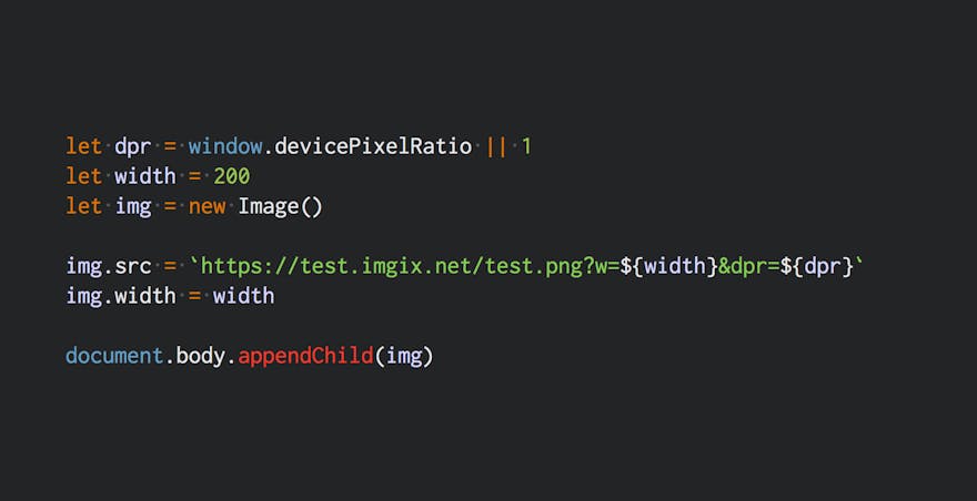
A dynamic image workflow helps again here. Instead of generating and storing every needed derivative for each image at 1x, 2x, and 3x versions, developers can pass along a dpr parameter based on the user’s device. A simple (rather contrived) example of this can be seen here:
let dpr = window.devicePixelRatio || 1
let width = 200
let img = new Image()

img.src = `https://test.imgix.net/test.png?w=${width}&dpr=${dpr}`
img.width = width

document.body.appendChild(img)
That example will display an image that is 200 CSS pixels wide, but 200 * dpr physical pixels wide. On a 2x display, there would be 400 physical pixels, 600 on a 3x display, etc. A neat side effect of this approach: As more and more people use devices with high-DPI screens, the 1x version may even eventually fall out of cache, without any additional developer effort.
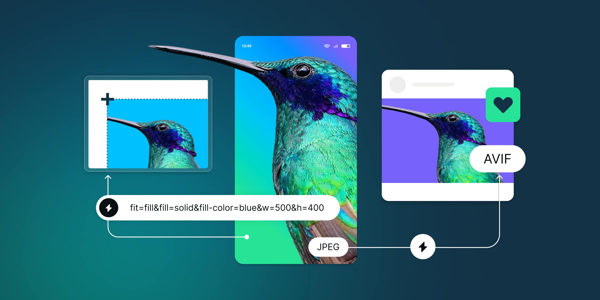
I recently used imgix to build out a user-facing photo editor. Where it really shone is in allowing easy edits and interoperability with other systems. Instead of having to manually generate and store each new user-generated crop, I simply stored a set of key/value pairs, mapping them to imgix parameters. By exposing those parameters to users, I was able to quickly create a non-destructive editor that only has to store a simple hash of data. A similar approach could also be used to show real-time previews of edits, backed by imgix (you can see examples of this in the imgix URL API documentation).
These are just a few ways imgix has helped me rethink my approach to common development issues. By leveraging imgix, I’m able to solve these problems easier, faster, and often better than I could otherwise, leaving me with more time to spend on other parts of my job.