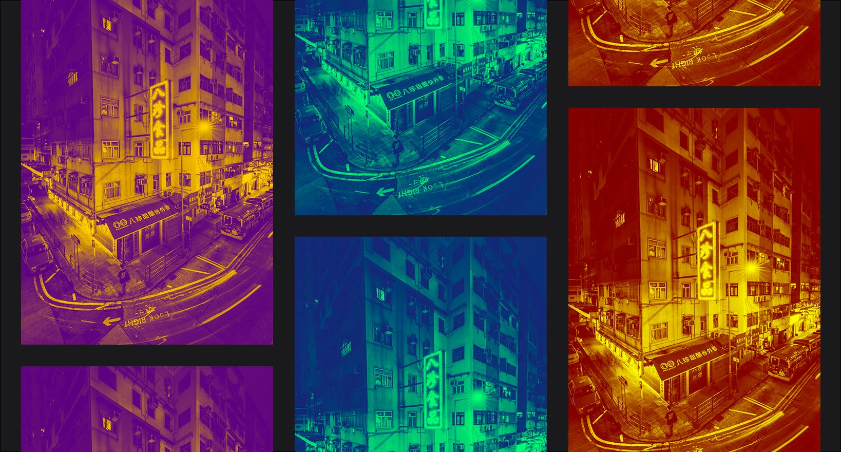
We’re always working hard to maximize the creative options available to imgix customers. Our latest feature is duotone, a striking artistic effect that can also be used to great advantage in branding and creating a unified feel across images. Read on to learn more about duotone, its many uses, and how to easily apply this image manipulation using our duotone parameter.
What Is Duotone?
A duotone image has a two-color gradient. To create it, an original image is first converted to greyscale, and then two colors, usually contrasting, are mapped to that gradient. In the example below, a gradient that runs from navy blue to coral is applied to the first image, resulting in the duotone effect in the second image.
Modern Uses of Duotone
1. Company Branding and Identity
Many designers rely on duotone to help create a recognizable or eye-catching brand. Duotone is commonly found in logos, for example, because a two-color image can offer both simplicity and bold contrast. With its reduced color scheme, which decreases visual noise, it can also provide a fitting backdrop for text or company logos, as in this example below:
2. A Sense of Cohesion
Another powerful feature of duotone is its ability to make images feel as if they belong together, even when they contain disparate subject matter or settings. Consider the trio of concert images below, with their varied lighting and color palettes:
With a duotone effect applied, the images immediately feel like part of a cohesive group. This effect can be a compelling storytelling tool, especially when crafting narratives across images.
3. Aesthetic Range
As a stylistic feature, duotone offers a range of outcomes with drastically different moods and visual impact, especially when we also bring transparency, brightness, and contrast into the mix. Occasionally duotone is called a passing trend, but this sentiment is usually directed toward the duotone effect at full opacity. We can tap into duotone’s true potential by modifying the transparency. Pictured below are three instances of the same image with different alpha transparency parameters applied. Note how the middle image doesn’t feel like a traditional duotone image and takes on an entirely different aesthetic quality.
As with alpha transparency, adjusting the brightness and contrast of an image also gives us greater control over duotone and thus a wider range of options. Below are the same duotone image at full opacity. Modifying the brightness and contrast can affect how much of each color appears, as well as the starkness of the difference between the colors.
?con=-10&bri=3
?con=50&bri=10
How to Use the Duotone Parameter
To create the duotone effect, simply append duotone={color1},{color2}
to your image’s parameter string. The first color will be mapped to the darker parts of the image, and the second to the lighter parts. Below, the first image sets navy blue as color1
and bright green as color2
; the second image reverses that order for the effect of a photo negative.
?duotone=191970,00FF7F
?duotone=00FF7F,191970
The duotone
parameter accepts 3- (RGB), 4- (ARGB) 6- (RRGGBB) or 8-digit (AARRGGBB) hexadecimal values. For more details, see the API documentation.
Note that the opacity of the duotone effect can be manually set using the parameter duotone-alpha={0-100}
. The default value is 100
, which makes the duotone fully opaque. Here are other useful parameters that can be used alongside duotone
to remarkable effect:
Have questions about using duotone or requests for other stylistic options? Don’t hesitate to reach out to us anytime.