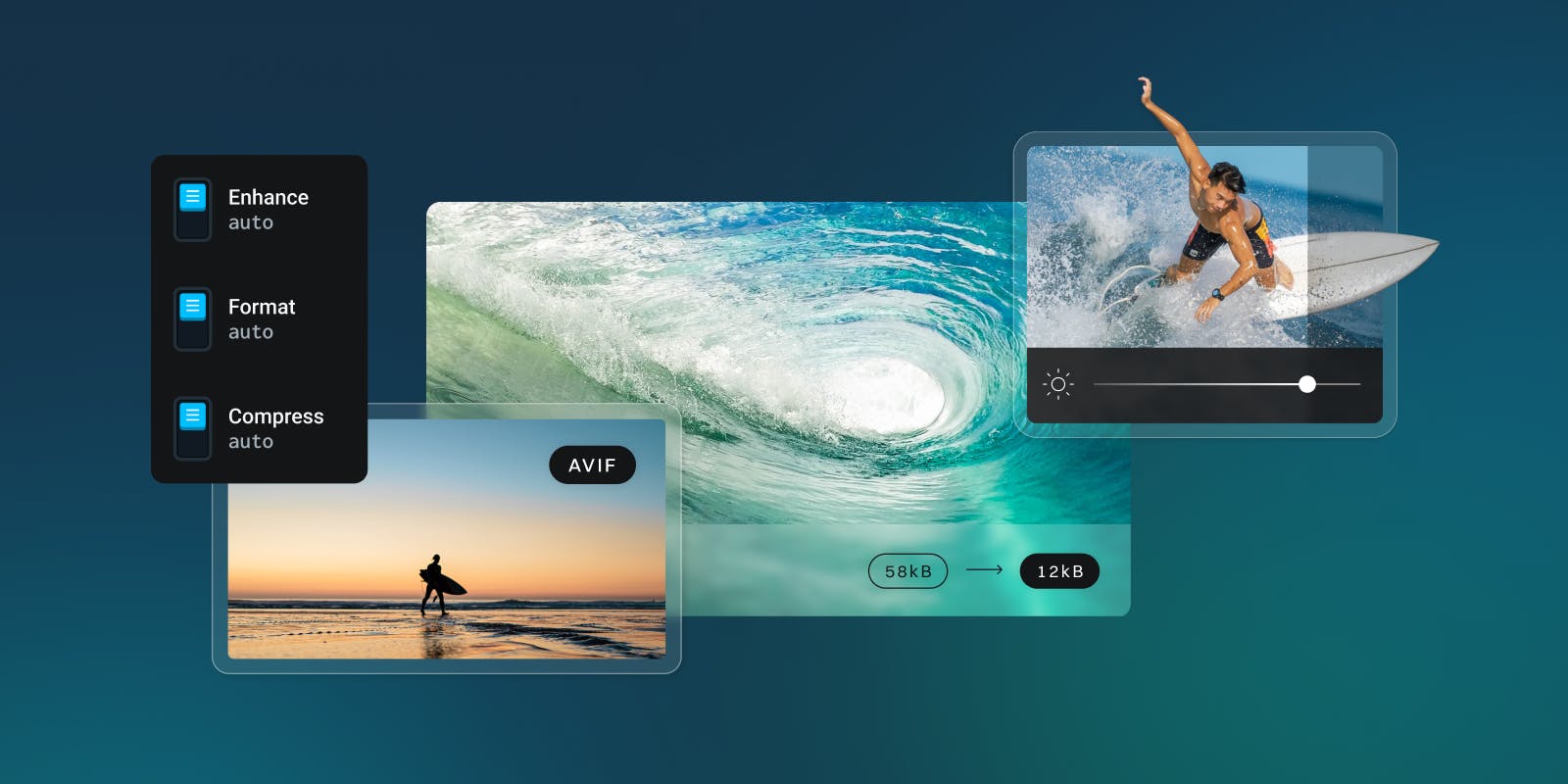
Using srcset and sizes, attributes have become a tried-and-true way to improving image-load-times on modern webpages. Together, they let the browser pick the most appropriate source-image on our site for the current display size. But they still require a significant amount of engineering time to get just right. srcset and sizes become difficult to maintain as developers cater to more screen sizes and resolutions, and one-page design change can require an update to all the images on a page. Thankfully, that’s where imgix comes in.
We’ve already seen how imgix can create source-sets on the fly, removing the need for manually defining a comma-separated list of URLs for each image. But what about the list of breakpoints we’ve needed for the sizes attribute?
Up until now, you’ve had to look for and update all of your site’s breakpoints relative to your images by hand. Then you’d pass that information on to the imgix library, which would leverage it to create the most optimized image tags possible.
 <img
  srcset="https://assets.imgix.net/unsplash/bridge.jpg?w=1024&h=1024&fit=crop 1024w,
    https://assets.imgix.net/unsplash/bridge.jpg?w=640&h=640&fit=crop 640w,
    https://assets.imgix.net/unsplash/bridge.jpg?w=480&h=480&fit=crop 480w"
  src="https://assets.imgix.net/unsplash/bridge.jpg?w=640&h=640&fit=crop"
  sizes="(min-width: 36em) 33.3vw, 50vw, 100vw"
>
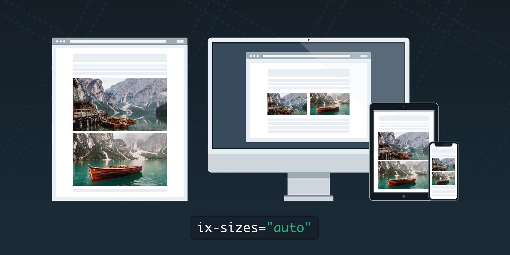
Letting ix-sizes="auto" do all the work
Starting with imgix.js v3.5.0, you can have the imgix client fill out all this information for you!
All you have to do is add an ix-sizes="auto" attribute to the image tags you’re already using with imgix.js and we’ll take care of the rest.
<img
  srcset="https://assets.imgix.net/unsplash/bridge.jpg?w=1024&h=1024&fit=crop 1024w,
    https://assets.imgix.net/unsplash/bridge.jpg?w=640&h=640&fit=crop 640w,
    https://assets.imgix.net/unsplash/bridge.jpg?w=480&h=480&fit=crop 480w"
  src="https://assets.imgix.net/unsplash/bridge.jpg?w=640&h=640&fit=crop"
  ix-sizes="auto"
>
imgix.js will automatically detect the rendered size of your image and update the sizes attribute to match. This will give the browser the information it needs to pick the most appropriate source for the image. So, even if the user resizes the window, your image will update to match the viewport’s current size.
But what if you change your page design and the break-points change? Since all you are setting on your images is ix-sizes="auto", you won’t have to make any changes. The library will detect the new breakpoints for you.
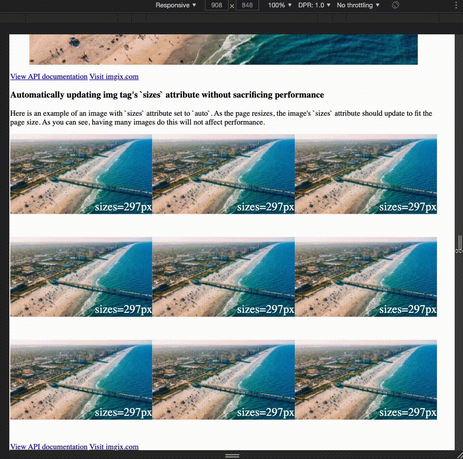
Code Example
To see auto-sizing in action, take a look at the embedded sandbox. In it the image gallery images’ sizes and srcset values are automatically being set by imgix.js. Each image has a little overlaid text with its current sizes value for demonstration purposes. As you resize the preview window, you can see the sizes value update to match.
Caveats
imgix.js’ new ix-sizes="auto" attribute saves developers engineering time spent trying to hone in on the appropriate break-points for the images 🎉.
But it does come with some limitations.
The sizes attribute was designed to give the break-points information to the browser as early as possible, typically before the images on the page have even rendered. Because imgix.js is loaded after the page's HTML markup, the browser gets the information about sizes just a tad-bit later than usual. This means that some of the performance gains from using the sizes attribute are lost, since the browser has to wait for imgix.js to load before it can make a decision.
Therefore, each developer needs to balance the desire to reduce engineering time spent implementing sizes on their images using ix-sizes="auto" with their performance needs.
Recommended readings