Back in the bad old days before the internet ate everything, it was common to define design as the way a product looked. This led to a certain dysfunctional paradigm. Design was the sole domain of someone called a “designer.” Engineers, who were in charge of how things worked, threw products over a fence to this miserable soul, and they somehow made those products beautiful.
Probably the designer’s process involved dark magic, the golden ratio, and whispered prayers to Dieter Rams. Nobody knew for sure, because nobody really talked to the designer. The only people consulted less were the users. They were forced to endure products that didn’t really fit their needs because nobody bothered to ask them what those needs were.
As an industry, we like to think we’ve moved past this. But peel back the covers at too many tech firms, and you see the same sad, siloed process.
At imgix, we think that’s silly. We bet we’re not alone.
That’s why we’re hosting an event on October 6 to discuss more holistic approaches to UX and design. We’ll be talking about how UX concepts can contribute to every stage of a product’s creation. We’ll also be talking about how feedback from these three sides—designers, developers, and users—can be mashed together to create amazing products and transformative experiences.
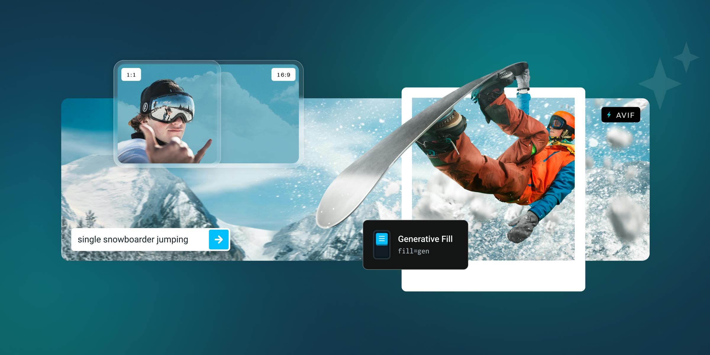
As responsive design patterns continue to consolidate into best practices, it’s become easier for designers and developers to think beyond just resizing and cropping images, and address how to maximize the impact of each image. Responsive art direction, with each image cropped to keep focus on the key elements at each size, is now easier than ever. In addition to our automated methods of cropping to areas of interest, we've now added complete manual controls for true focal point cropping and zooming.
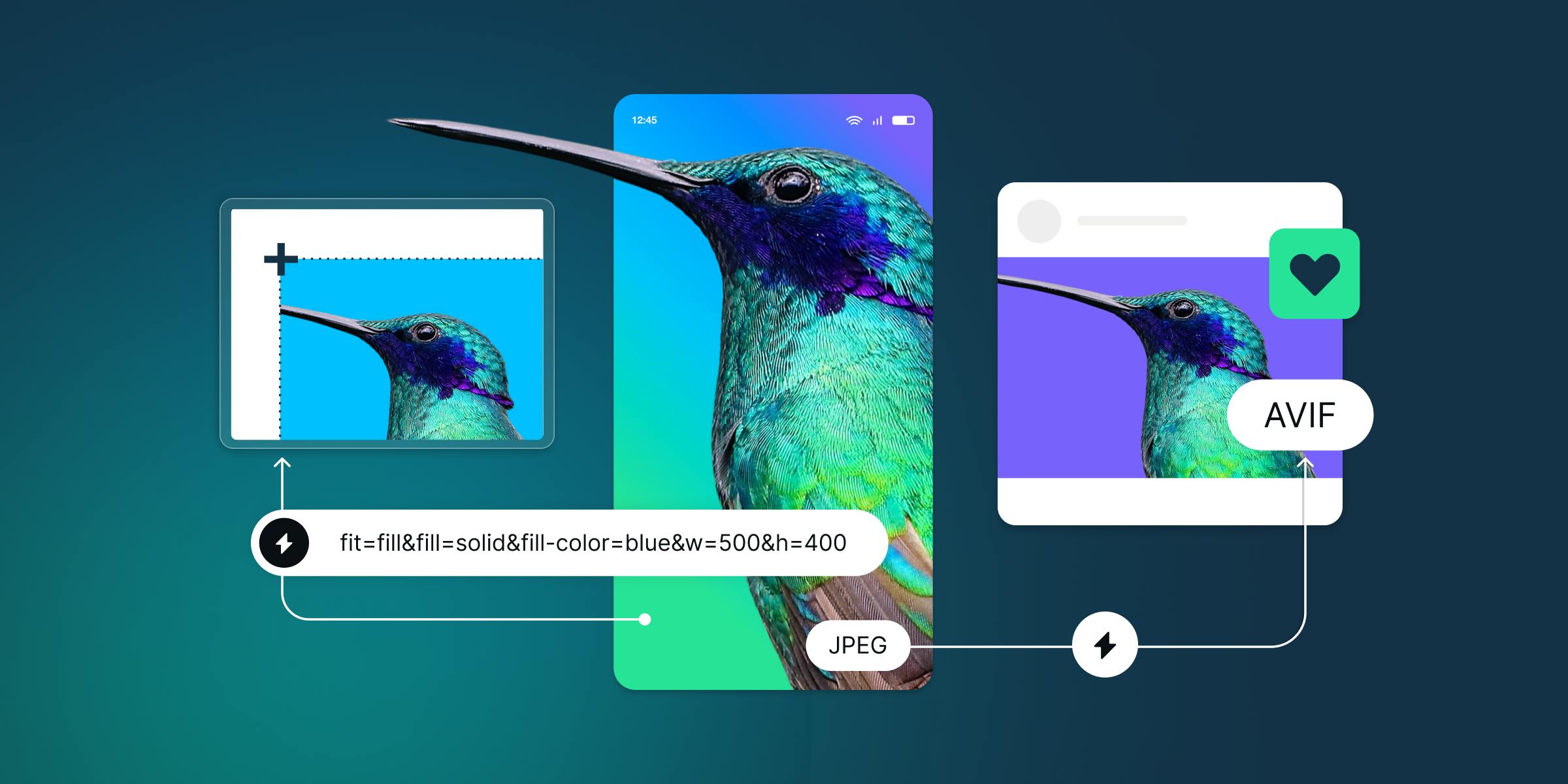
Normalizing a large library of images like product photos or logos can be a headache. With wildly varying sizes and aspect ratios that all have to display well inside the same sized container, finding a way to automatically resize correctly is crucial. It’s especially important not to resize images beyond their original dimensions or stretch them, and that’s where imgix’s fit=fillmax parameter can help.
Many developers are aware of responsive imagery, but don't implement it for two reasons: the assets are difficult to generate, and the HTML is difficult/confusing/tedious to write. Using a library to generate your code can simplify the implementation. imgix.js, our flagship library, was designed to do just that. Responsive design patterns have solidified over the past few years, so we're releasing a major update of imgix.js that takes advantage of the modern web and imgix's ability to generate different asset sizes on demand.
One of imgix's most powerful benefits is the ease of setting up the service and serving better images right away. This is true whether you're serving images directly to your customers or building a platform for others to use. One of our customers, Stream, demonstrated this in their tutorial about building a demo app called Cabin in React with their feed service.
Here's how they did it, in their own words. (This is part 5 in their series.)
"Page weight" may well become the new chant to replace "developers, developers, developers." As websites continue to become more visually rich (and need to, to be effective), ensuring that visitors don’t have to wait for images is paramount.
So, how to make sure that your site loads as quickly as possible but still with a visually compelling experience? The Low-Quality Image Placeholders (LQIP) method initially loads a low-quality, smaller version of the final image to fill in the container until the high-resolution version can load.


