
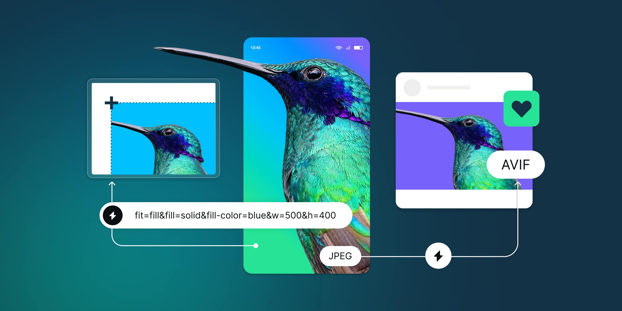
Many developers are aware of responsive imagery, but don't implement it for two reasons: the assets are difficult to generate, and the HTML is difficult/confusing/tedious to write. Using a library to generate your code can simplify the implementation. imgix.js, our flagship library, was designed to do just that. Responsive design patterns have solidified over the past few years, so we're releasing a major update of imgix.js that takes advantage of the modern web and imgix's ability to generate different asset sizes on demand.
This is a major release, so it includes breaking changes. imgix.js 3.0 presents a new API that provides more stability and better performance. It no longer relies on event listeners to trigger changes on <img> tags. Instead of responding dynamically to viewport changes, it generates a comprehensive set of srcset and sizes declarations based on the parameters you provide it.
This moves much of the decision-making around which image to download to the browser: a modern browser will select the correct image to display given these signals. Rather than rely on event listeners to set the src on <img> elements, imgix.js 3.0 generates an exhaustive srcset to enable the browser to decide.
For example, in version 3.0, this:
<img
ix-src="https://assets.imgix.net/unsplash/hotairballoon.jpg?w=300&h=500&fit=crop&crop=right"
alt="A hot air balloon on a sunny day"
>
will generate the following HTML:
<img
ix-src="https://assets.imgix.net/unsplash/hotairballoon.jpg?w=300&h=500&fit=crop&crop=right"
alt="A hot air balloon on a sunny day"
sizes="100vw"
srcset="
https://assets.imgix.net/unsplash/hotairballoon.jpg?w=100&h=167&fit=crop&crop=right 100w,
https://assets.imgix.net/unsplash/hotairballoon.jpg?w=200&h=333&fit=crop&crop=right 200w,
…
https://assets.imgix.net/unsplash/hotairballoon.jpg?w=2560&h=4267&fit=crop&crop=right 2560w
"
src="https://assets.imgix.net/unsplash/hotairballoon.jpg?w=300&h=500&fit=crop&crop=right"
ix-initialized="ix-initialized"
>
This squarely hits the resolution switching responsive image use case.
You can simplify even further by setting imgix.config.host to your imgix Source when calling the library. This allows you to set the params in JSON format, removing the need to type the Source name repeatedly and making the parameter listing more easily nestable and readable.
<!-- In the <head> -->
<meta property="ix:host" content="assets.imgix.net">

<!-- Later, somewhere in the <body> -->
<img ix-path="unsplash/hotairballoon.jpg" ix-params='{
  "w": 300,
  "h": 500,
  "fit": "crop",
  "crop": "right"
}' alt="A hot air balloon on a sunny day">