DatoCMS is an API-first headless CMS, which means that all of the CMS functionality we offer is programmable through our API. As with any CMS, images are a big part of the content that we handle for our users. While images are a spectacular way of improving conversions, enhancing the user experience, and engaging visitors, they also pose a real engineering and design challenge.
As new devices boast retina displays and higher resolutions, designers are eager to leverage these resolutions to provide beautiful vibrant graphics. But, that comes at a cost: asset size and potentially site performance. To get a sense of the growth, average page weight has increased by 34-55% in the last 3 years, of which 70% is due to heavier images. If you’re on a fiber connection, downloading 1.7MB of data for a single web page might not slow you down much, and it gives you a richer experience. But if you’re on a cellular connection, you would probably prefer a lower quality image to a painfully slow page.
While optimizing web pages for such a wide range of resolutions, pixel densities, and network connection speeds is a complex matter, we wanted to make it as easy as possible for our users to do exactly that.
To achieve this, we leveraged imgix, making their image platform available from within our API. This allowed us to easily provide image optimization and transformation functionality programmatically to our end users.
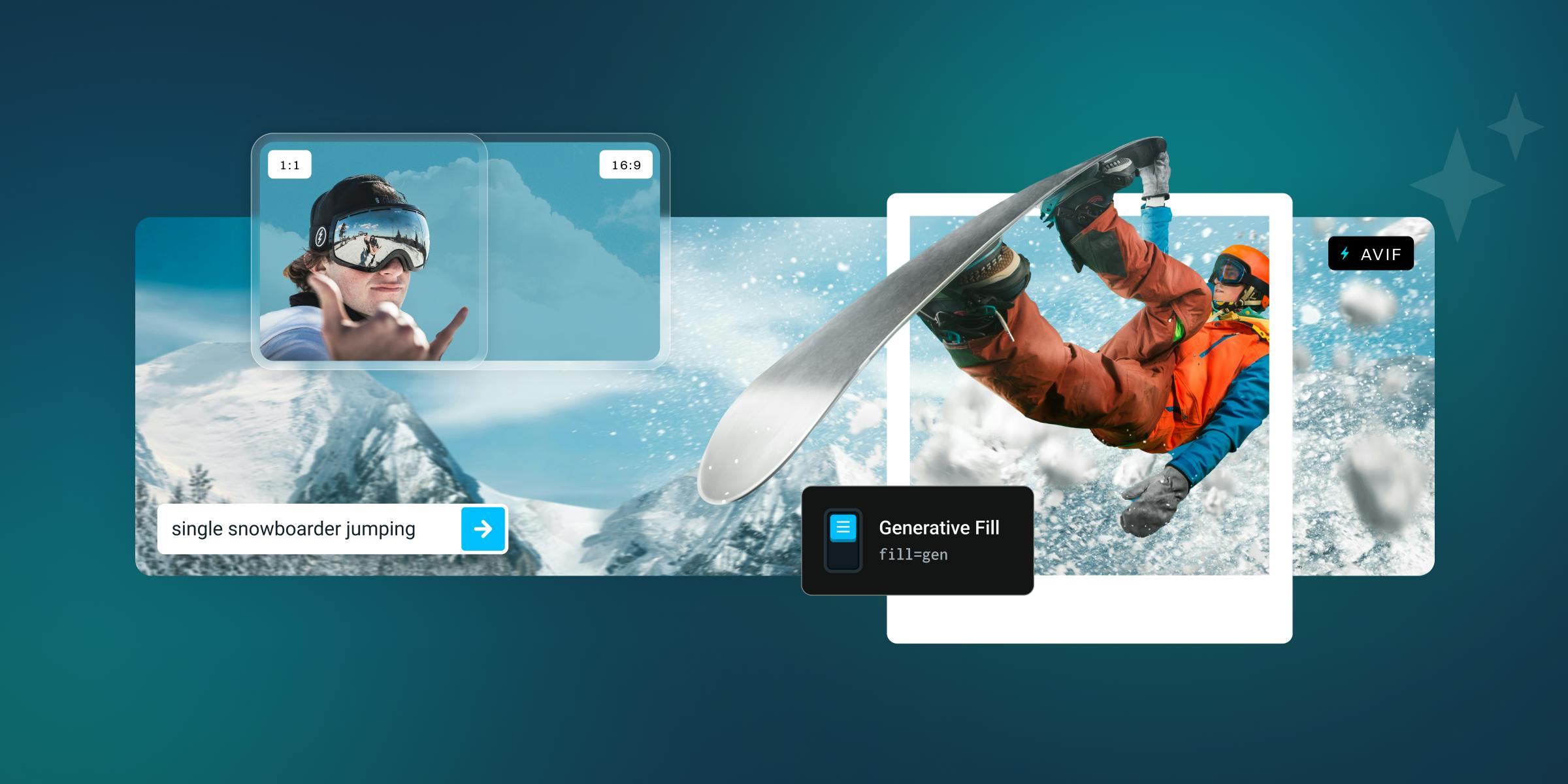
With a single API call, DatoCMS images can be transformed to be:
- responsive
- progressive
- WebP-optimized
- lazy-loaded
- LQIP-ready
- and more
Let's start with the basics
At a minimum, our GraphQL CDN-powered API can give you the URL of an image you uploaded, together with its width and height:
query MyQuery {
  blogPost {
    coverImage {
      url
      width
      height
    }
  }
}
This is what you expect to get with most CMSs; we can do better than that.
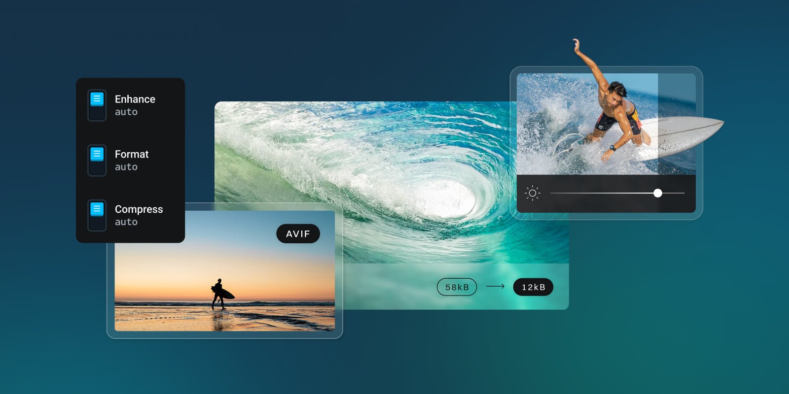
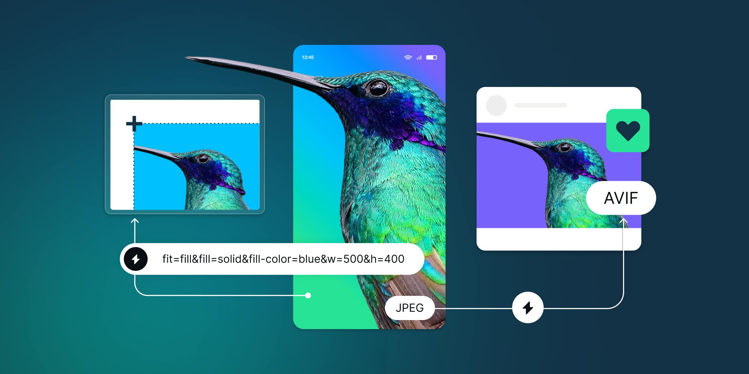
Re-encoding and downscaling
The first optimization you can get for free with DatoCMS is converting your image to JPEG or WebP with the auto=format argument. This will automatically provide the best option that the receiving end can support. You can easily adjust the output quality if needed. The default is 75, which represents a value as close as possible as the original quality of the image, minus reductions of heavy metadata. It's not a percentage score, so going above 75 does not guarantee better quality.
query MyQuery {
  blogPost {
    coverImage {
      url(imgixParams: {auto: format, q: 60})
    }
  }
}
How does this work? Well, every image you upload to DatoCMS is stored on our cloud infrastructure and then imgix provides on-the-fly manipulations and caching.
The beauty is that since it’s GraphQL, you can easily see the documentation of all the different transformations right from the query explorer, and every argument is strongly typed, so you don’t have to worry about typos:
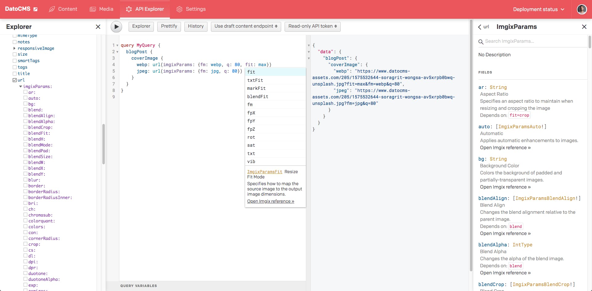
If you need to downscale your original image to take into account low-resolution devices, you can just add a couple of parameters to the same query:
query MyQuery {
  blogPost {
    coverImage {
      lowRes: url(imgixParams: {auto: format, q: 60, fit: max, w: 800, h: 600})
      mediumRes: url(imgixParams: {auto: format, q: 60, fit: max, w: 1024, h: 768})
    }
  }
}
The fit: max argument will resize the image to fit within a specific dimension without cropping or distorting the image, but will not increase the size of the image if it is smaller than the output size. The resulting image will maintain the same aspect ratio of the input image. imgix provides plenty of resizing/cropping modes you can use; you just have to change the fit parameter, and DatoCMS will do the rest.
What about progressive images and lazy loading?
One of the most useful techniques you can implement to reduce initial load times and cut down traffic costs drastically is to implement lazy loading. With lazy loading, you use JavaScript to defer the loading of images only when a visitor scrolls down to them, avoiding useless HTTP requests and data download before time.
The problem with lazy loading is the infamous content reflow, that causes content to be pushed down or up to a different location, making the page feel like it has bad performance.
Here’s a simple example demonstrating the effect:
To make content reflow as invisible as possible you can use progressive images to load a lower quality image before an improved version later.
The underlying idea is that perceived speed is more important than actual speed, so offering an extremely low quality version of an image as soon as possible, and then progressively enhancing it after fetching additional data will produce a better user experience.
Color background placeholders against content reflow
A better way to avoid content reflow is to know the aspect ratio of your images beforehand so that you can:
- wrap the image in a
<div>with the same aspect ratio as the image; - load the image in background and when it’s ready…
- … replace the
<div>with the final image, maybe with a subtle transition effect.
Here's the result:
Color background placeholders for lazy loading
We can fill the placeholder space in our HTML page with a background color representative of the image that is being loaded if we know the dominant color beforehand. That’s exactly what Google Search does, and the result might look something like this:
With DatoCMS, you can easily get both the image size and dominant colors in one call:
query MyQuery {
  blogPost {
    coverImage {
      url(imgixParams: {fm: jpg})
      width
      height
      colors { hex }
    }
  }
}
Image placeholders (LQIP)
Medium and Facebook popularized a variant of this technique that has a much broader range of use than background-color placeholders, and is being referenced around the web with different names:
- Embedded Image Preview (EIP)
- Low Quality Image Placeholders (LQIP)
- Blur-up Image Loading
The technique relies on:
- precomputing a very lightweight thumbnail of the original image beforehand (< 1KB);
- embedding it directly inside the HTML of the page in base64 format;
- scaling it up to take up the size of the original image to load.
The result is a blurred-up preview of the original image immediately visible to the visitor, without the need to perform any additional HTTP request or fetch more data. We are also avoiding content reflow:
With DatoCMS, you can get the base64 encoded placeholder of your original image with the blurUpThumb query. You can pass the exact same transformations you asked for your original image so that the placeholder will be properly aligned:
query MyQuery($params: ImgixParams) {
  blogPost {
    coverImage {
      url(imgixParams: $params)
      blurUpThumb(imgixParams: $params)
    }
  }
}
Putting it all together: introducing the responsiveImage query
Now that we’ve covered everything that’s involved in offering best-in-class images to your web pages, it’s time to show how you can solve everything with a single GraphQL query to our CDN:
query MyQuery {
  blogPost {
    coverImage {
      responsiveImage(imgixParams: {auto: format, fit: crop, w: 600, h: 600 }) {

        srcSet             # <- HTML5 src/srcset/sizes attributes
        sizes              #
        src                #

        width              # <- size information
        height             #
        aspectRatio        #

        alt                # <- SEO attributes
        title              #

        bgColor            # <- background color placeholder

        base64             # <- blur-up placeholder, base64-encoded JPEG
      }
    }
  }
}
The responsiveImage query takes some imgix transformation parameters as well, and returns everything you might ever need to show your images:
- HTML5
src,srcsetandsizesattributes that you can directly feed to your<img>elements to get out-of-the-box responsive images. Thanks to theauto: formatparameter, modern browsers will automatically get the WebP version of the images, saving some extra KB; - The SEO
altandtitleattributes you specified within DatoCMS; - Size information (
width,heightandaspectRatio) to properly handle content-reflow. These dimensions will be the ones you’ll get after the imgix transformations you requested, so you can use them directly into your HTML; - Dominant background color (
bgColor) if you want to go with the background color technique; - Blur-up base64 placeholder (
base64) if you want to go with the LQIP technique.
If you just want lazy-loaded responsive images, your HTML could be something like this:
<picture>
  <source srcset="{{srcSet}}">
  <img src="{{src}}" alt="{{alt}}" title="{{title}}" loading="lazy">
</picture>
Want to avoid content reflow?
<div style="position: relative;">
  <div style="padding-top: {{100.0 / aspectRatio}}%;">
  <picture style="position: absolute; left: 0; top: 0; width: 100%">
    <source srcset="{{srcSet}}">
    <img src="{{src}}" alt="{{alt}}" title="{{title}}" loading="lazy">
  </picture>
</div>
Want to add background color placeholders? Just add bgColor to the outer <div>:
<div style="position: relative; background-color: {{bgColor}};">
  <div style="padding-top: {{100.0 / aspectRatio}}%;">
  <picture style="position: absolute; left: 0; top: 0; width: 100%">
    <source srcset="{{srcSet}}">
    <img src="{{src}}" alt="{{alt}}" title="{{title}}" loading="lazy">
  </picture>
</div>
Prefer blur-up LQIP? Throw base64 in the mix:
<div style="position: relative; background-image: url({{base64}}); background-size: cover;">
  <div style="padding-top: {{100.0 / aspectRatio}}%;">
  <picture style="position: absolute; left: 0; top: 0; width: 100%">
    <source srcset="{{srcSet}}">
    <img src="{{src}}" alt="{{alt}}" title="{{title}}" loading="lazy">
  </picture>
</div>
And bear in mind, thanks to the power of GraphQL, you can combine multiple queries in a single API call. You can basically fetch the whole content of a webpage, both text and images, with no extra latency in a single, CDN-powered HTTP request:
query MyQuery {
  allBlogPosts {
    title
    slug
    excerpt
    content
    publishedAt
    author {
      name
      avatar {
        responsiveImage(imgixParams: {format: auto, fit: crop, w: 50 height: 50 }) {
          ...responsiveImageFragment
        }
      }
    }
    coverImage {
      responsiveImage(imgixParams: {format: auto, fit: crop, w: 600, height: 600 }) {
        ...responsiveImageFragment
      }
    }
  }
}

fragment responsiveImageFragment on ResponsiveImage {
  srcSet
  sizes
  src
  width
  height
  aspectRatio
  alt
  title
  bgColor
  base64
}
Conclusion
Responsive and progressive images are one of the main building blocks for the modern web, and developers need higher-level primitives to handle them without going crazy. At DatoCMS we believe that the right layer to provide such primitives is in the API, making them accessible in every possible context. We were able to achieve this for our customers with the help of imgix.
We’ll keep on improving image management and our GraphQL API as we gather more feedback from the real-world scenarios of our customers. As always, we would love to hear your thoughts on this! If you'd like to share feedback, ask questions, or just shout KUDOS, you can reach out to us on our Community, Twitter, Slack, and of course, Support.