
Responsive images are a critical component of the modern website, but they can also be time-consuming for frontend developers to deploy and manage. Historically developers have had to create multiple sizes of each image to account for different device resolutions. Fortunately, the srcset attribute alleviates that need by directing the browser to identify the best image size based on available options.
The srcset attribute is one of the best tools for optimizing a site’s images—and by extension, its performance. In this post, we’ll discuss how imgix simplifies use of the srcset attribute and walk you through our latest srcset capability: automatic generation for all of our Core Libraries.
The challenges of using srcset
We’ve previously covered how srcset can help support different device pixel ratios, but using the attribute correctly can be difficult for a couple reasons:
- Using workflows where each image must be manually transformed and saved can be labor- and time-intensive.
- Even after the transformations have been completed, the cost of making changes or fixing mistakes can be high.
imgix’s on-the-fly image transformation and optimization service is uniquely positioned to mitigate these exact issues. Instead of having to manually resize each image and save it locally or in cloud storage, you can quickly specify those transformations within each srcset entry using imgix rendering parameters.
Yet some questions remain for those considering using the srcset attribute: How do you know exactly what size breakpoints to specify? And how many different image variations should be specified? We had these needs in mind when we began thinking about how customers might be able to generate custom srcset attributes with imgix.
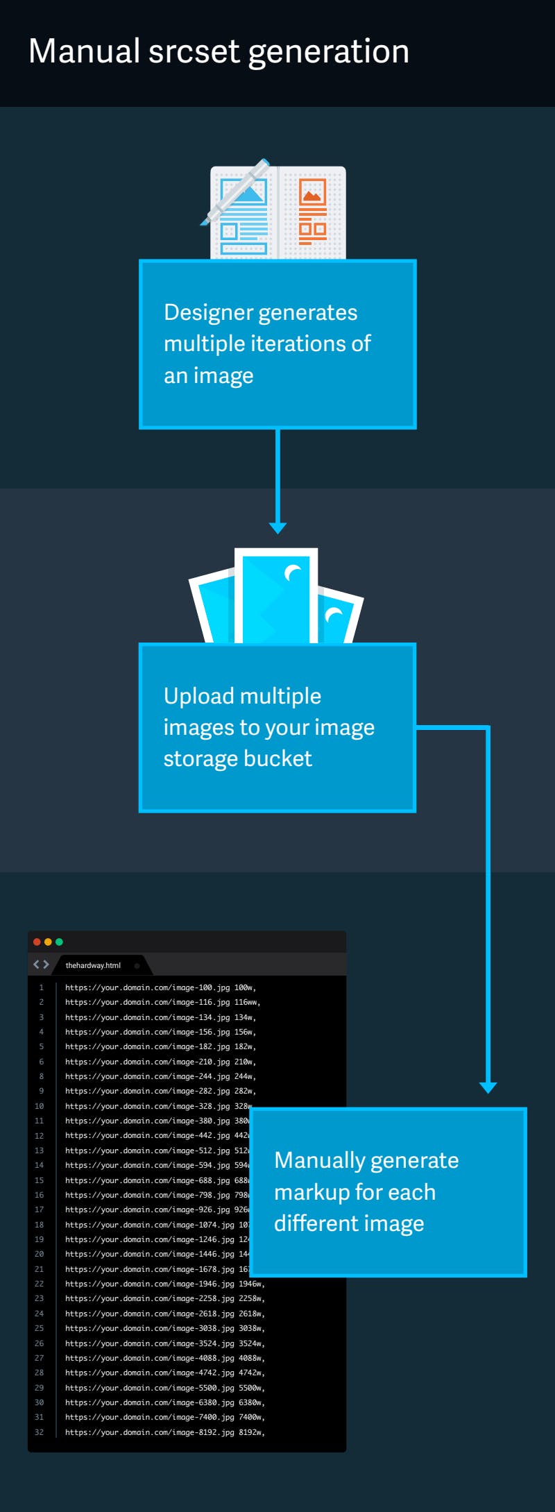
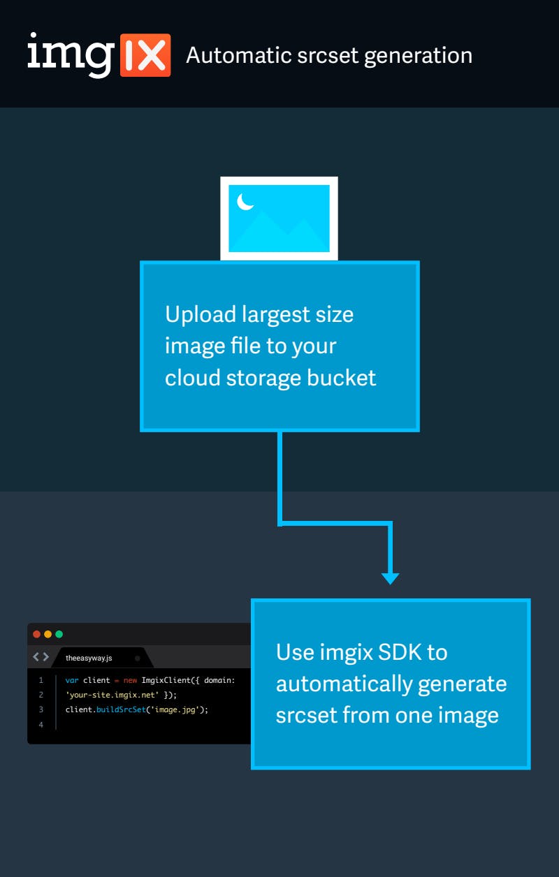
Manual srcset generation is more complicated than generating them automatically with imgix.
Automatic srcset generation
Thus far, imgix’s primary focus with our Core Libraries has been to help users generate imgix URLs quickly and easily. In the last year, we’ve started thinking about other ways we can provide value to our users looking to support responsive images on their sites. As a result, we have added support for automatic srcset generation to all of our Core Libraries.
Automatic srcset generation comes in one of two forms, fluid-width or fixed-width:
- fluid-width, also known as a width descriptor
srcset, can be used to serve different-sized images based on the browser viewport width. - fixed-width, also known as a pixel density descriptor
srcset, can be used to serve the same-sized image at different resolutions.
Depending on your use case, you will likely want to generate your srcset using one of these two methods. Luckily, our SDK’s interface allows you to easily designate which form to generate and construct it with your desired render API parameters.
How to use srcset generation with imgix
Let’s look at how you can automatically generate srcset with imgix. To get started, navigate to our Libraries page and select a Core Library in your language of choice. For the purpose of this example, we’ll demonstrate srcset generation using the JavaScript library (imgix-core-js).
The library exposes a new function buildSrcSet, which generates a fluid-width srcset by default. Here’s how the function looks:
var ImgixClient = require('imgix-core-js');

var client = new ImgixClient({
  domain:'testing.imgix.net',
  includeLibraryParam:false
});

var srcset = client.buildSrcSet('image.jpg');
This function will generate a fluid-width srcset attribute similar to the following:
https://testing.imgix.net/image.jpg?w=100 100w,
https://testing.imgix.net/image.jpg?w=116 116w,
https://testing.imgix.net/image.jpg?w=135 135w,
                                    ...
https://testing.imgix.net/image.jpg?w=7400 7400w,
https://testing.imgix.net/image.jpg?w=8192 8192w
You may notice that the buildSrcSet function will return a string of approximately 31 srcset entries. These 31 entries ensure that there is at maximum an 8 percent difference (also known as “width tolerance”) between the desired image width on the page and the delivered image width from imgix. We tested different width tolerances over different screen sizes, images, and resolutions.
Increasing width tolerance will improve cache hits because there will be fewer derivative versions of an image, and thus a higher chance that a user will request an image that has already been cached. The downside is that visual performance will decrease due to the scaling of images, and bandwidth increases exponentially with increased tolerance. Since caching can be a significant factor in an image’s load time, it is usually more important than image size.
Although we couldn’t find any differences in visual performance at 16 percent, we decided to be conservative and chose a tolerance of 8 percent to uphold our commitment to superior image quality. This ensures that your images will automatically look great at any resolution—from 100px all the way to 8192px—no matter what devices your customers are using.
If you require a fixed-width srcset instead, you will have to specify certain rendering API parameters when calling buildSrcSet. The specific parameters that result in a fixed-width parameter are w (width), or h (height) and ar (aspect ratio) together. Given these dimensional parameters, the browser will be able to serve the best-sized image based on the user’s device resolution:
// either pass a `w` (width),
// or
// `h` (height) and `ar` (aspect ratio) to

var srcset = client.buildSrcSet('image.jpg', {
  w: 800
});

console.log(srcset);
This generates a fixed-width srcset constructed with as many device pixel-width combinations as the imgix rendering API supports:
https://testing.imgix.net/image.jpg?dpr=1&q=75&w=800 1x,
https://testing.imgix.net/image.jpg?dpr=2&q=50&w=800 2x,
https://testing.imgix.net/image.jpg?dpr=3&q=35&w=800 3x,
https://testing.imgix.net/image.jpg?dpr=4&q=23&w=800 4x,
https://testing.imgix.net/image.jpg?dpr=5&q=20&w=800 5x
You will also notice a few things in this srcset attribute:
- A
dpr(device pixel ratio) parameter is added for each entry, corresponding to each pixel density - A variable
q(quality) is included for each entry. Since high-DPR images are displayed at a higher pixel density on devices, image quality can be lowered to reduce overall file size without sacrificing perceived visual quality.
For most users, one of these two routes will cover the majority of your needs as well as supply you with some default time- and bandwidth-saving behaviors.
Conclusion
In this post we walked you through how to serve responsive size switching with automatic srcset generation and gave you an example of this function in action in one of our Core Libraries. This expansion to the SDK interface will provide even more utility to our users to easily construct responsive images with imgix and without concern over configuration.
We will continue to evaluate other ways in which we can automatically provide utilities to our customers. If you have feedback about this enhancement or other ideas, we’d love to hear from you. Email our support team at support@imgix.com.