
Nuxt has recently released a new image optimization module, which allows developers to easily optimize their images within Nuxt without having to install additional third party libraries. imgix is happy to be one of the first image providers to work with the new Nuxt Image Component. This blog will show you some great examples of how you can set up and use these transformations with <nuxt-img>.
Why Use imgix?
You might be initially wondering, why should I use imgix with the Nuxt Image component? Nuxt is already including an open-source module to optimize my images. Yes, the IPX instance included with Nuxt Image is a good module to help optimize locally hosted images. Here are some great reasons why you should use imgix instead:
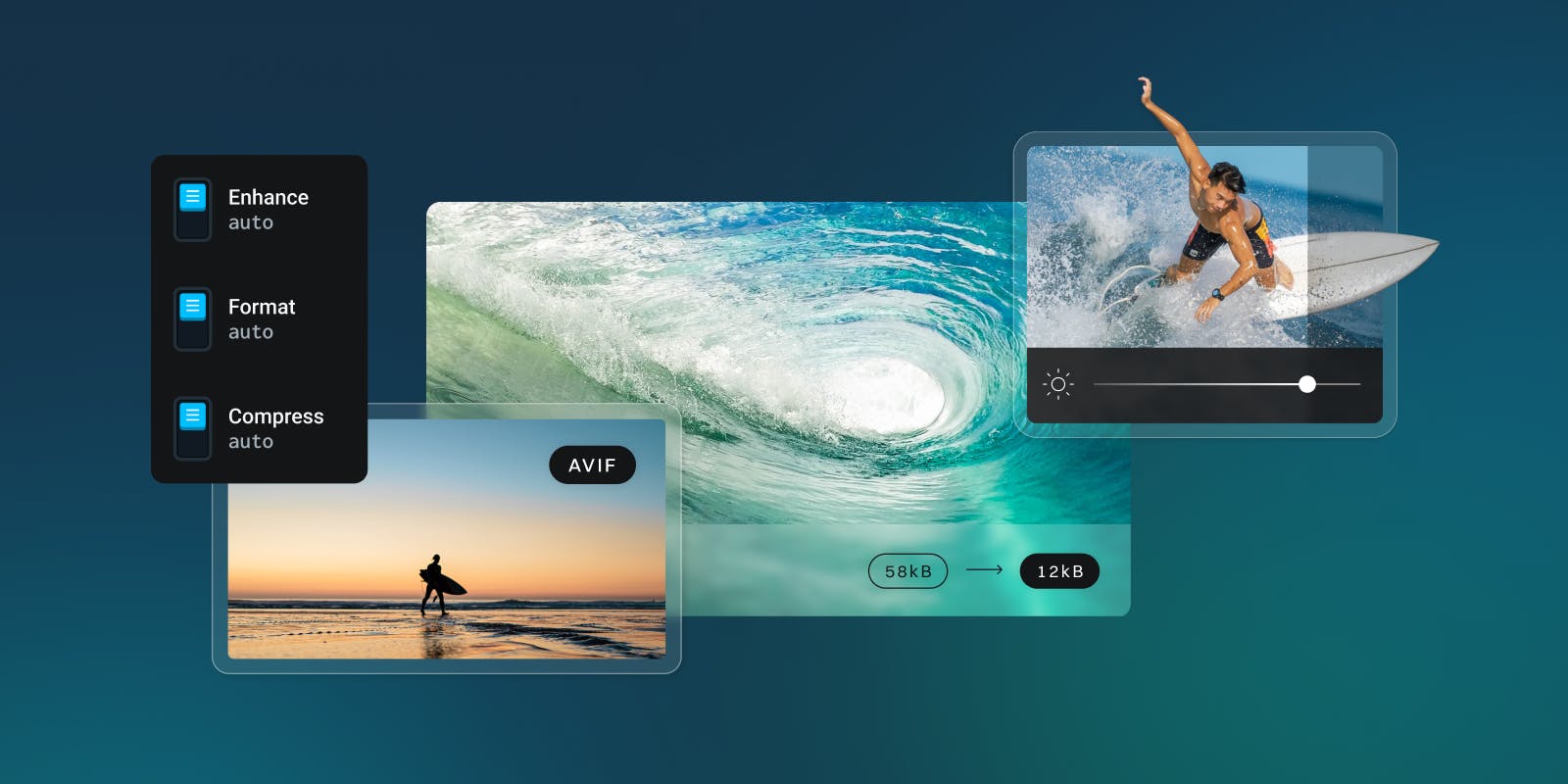
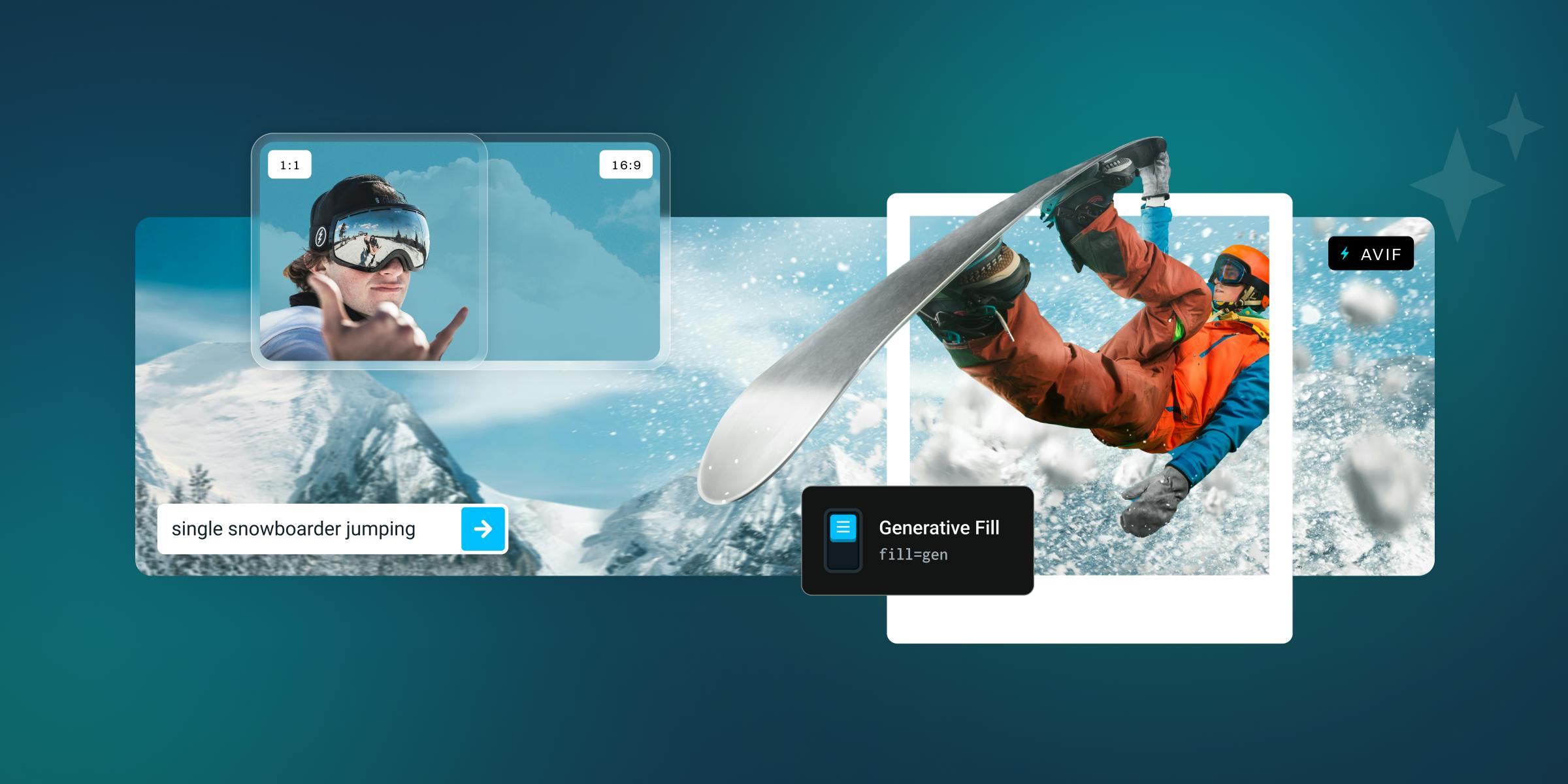
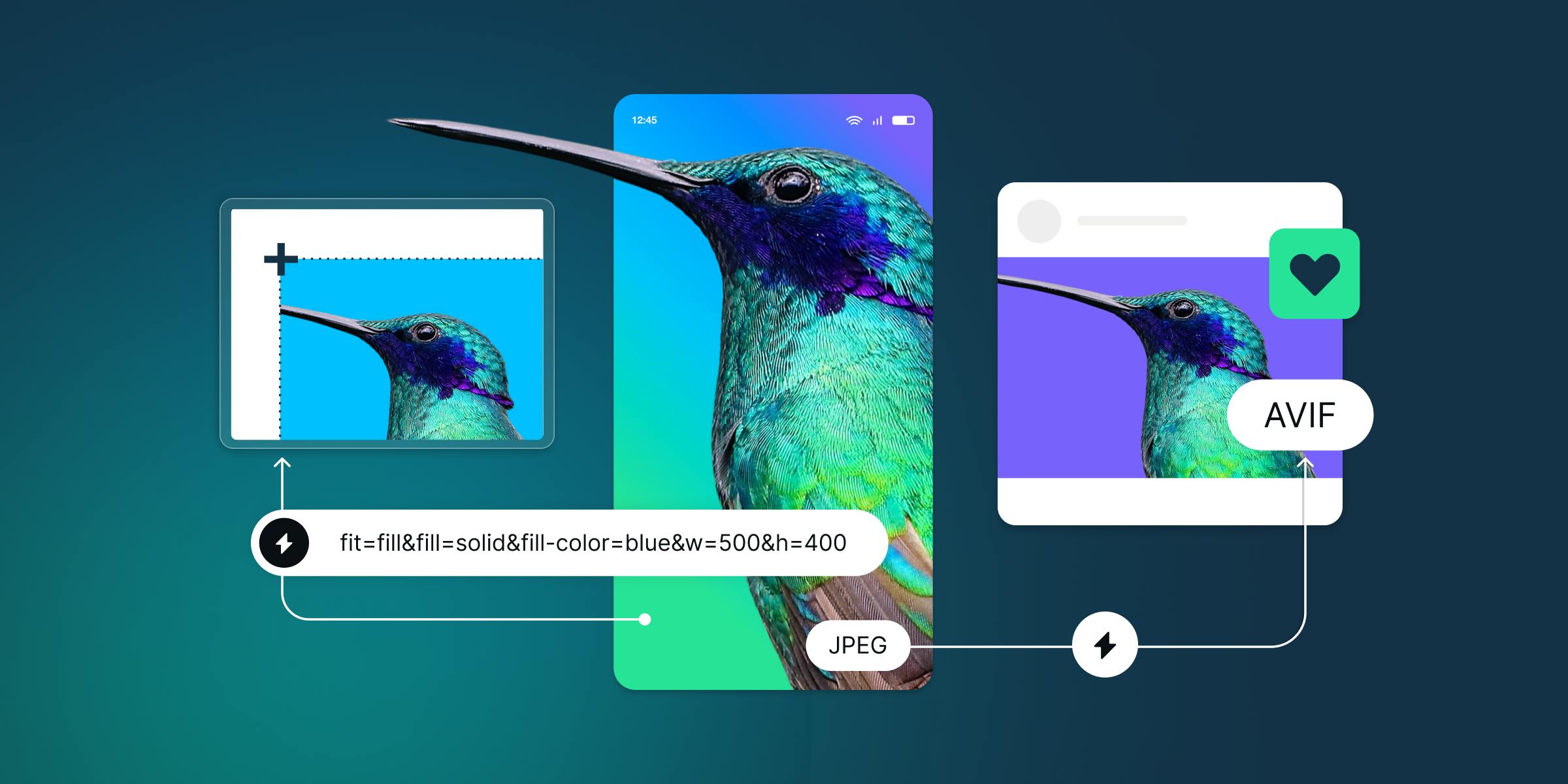
- imgix empowers developers with 120+ API transformations for their images.
- No need to edit the images beforehand, you can do that all with imgix.
- Using an open-source image module will also increase your build time with Nuxt, since the images are being processed during the build.
- imgix can also simplify your image management needs. We connect to wherever your images are stored, like an S3 or GCS bucket, and we will provide a UI or API to easily organize and access those images.
- imgix includes global CDN delivery with a custom Fastly instance.
- imgix has a free tier, so even if you have a small project you are working on you can get access to all of these imgix features with that free tier!
This will certainly supercharge your website or project beyond what is initially offered with the include IPX instance.
Getting Started with imgix
If you already have an account with imgix, move on to the Installation steps section. If you need an imgix account, you can sign up for a free account here. Once signed up, you will need to set up a source and choose your imgix domain. Once your source is set up, you can either start serving images that are currently in your storage with your new imgix domain, or you can upload new images as well. You can find more in-depth instructions on the imgix set up page as well.
Installation steps
In order to use the Nuxt Image Component you will need to install it in your already created Nuxt project. If you would like to see the complete installation instructions, you can view them at Nuxt's Website. In these instructions, I am assuming you already have an existing Nuxt project, or you have recently created one, that is going to be statically hosted. First, you will need to install the Nuxt Image component:
npm install -D @nuxt/image
Then, you need to add the newly installed devDependency to your nuxt.config.js:
export default {
  target: 'static',
  buildModules: [
    '@nuxt/image',
  ]
}
Then, you will need to configure an image section in the nuxt.config.js with your imgix domain:
image: {
    imgix: {
      baseURL: "https://assets.imgix.net"
    }
  },
Using the <nuxt-img> Tag with imgix
You can now replace <img> tags with <nuxt-img> tags. You would select the imgix, add the image path name to the src tag, and then have the ability to add additional props to further optimize your images. Here is a typical example that you can also find in the Nuxt Image documentation:
<nuxt-img
  provider="imgix"
  src="/blog/woman-hat.jpg"
  width="300"
  height="500"
  fit="cover"
  :modifiers="{ auto: 'format,compress', crop: 'faces' }"
/>
This would result in a 300 x 500 image, that has optimized the format depending on a browser, is automatically being compress, and intelligently cropping to the face of the image. Here is the resulting url: https://assets.imgix.net/blog/woman-hat.jpg?w=300&h=500&fit=crop&crop=faces&auto=format,compress
Creating a Responsive Design with Nuxt Image
A more complex example would be using the sizes attribute to build out a responsive design. If you would like to create an image gallery, that is set up as columns and uses a responsive design to become full width on mobile, you can actually pass this in the sizes attribute and Nuxt will generate the appropriate size image for each media width. Adding something like this would generate a responsive srcset in an image tag:
<nuxt-img
  provider="imgix"
  src="/blog/woman-hat.jpg"
  fit="crop"
  sizes="sm:100vw md:100vw lg:50vw xl:33vw"
  :modifiers="{ auto: 'format,compress', crop: 'faces,edges', ar: '1:1' }"
/>
A good tip here, even though my small and medium sizes are going to both be 100vw, you should enter them both. The more size options you add, the more sizing options that will be available in your resulting srcset. Also remember, with imgix, you have an unlimited amount of renders with all of your images, so there is no reason why you shouldn't include many resizing options to ensure you always have the best size image being loaded on your website.
You might have noticed some additional items that I included in the modifiers compared to my first example. I added an ar: 1:1 to the modifier. This will crop all of my images to a square. You might at first be concerned that I am going to crop all of my images. I have actually also modified my crop request to be faces,edges. So if an image is not a square and I end up cropping portions of the image, I will ensure that I do not crop out any faces. If there are no faces, then the image will focus on the prominent edges in the picture as well.
Here is an example of the resulting image tag from the above nuxt-img:
<img
src="https://assets.imgix.net/blog/woman-hat.jpg?auto=format,compress&crop=faces&ar=1:1&w=397&fit=crop"
sizes="(max-width: 640px) 98vw, (max-width: 768px) 98vw, (max-width: 1024px) 49vw, 31vw"
srcset="https://assets.imgix.net/blog/woman-hat.jpg?auto=format,compress&crop=faces,edges&ar=1:1&w=627&fit=crop 627w, https://assets.imgix.net/blog/woman-hat.jpg?auto=format,compress&crop=faces,edges&ar=1:1&w=753&fit=crop 753w, https://assets.imgix.net/blog/woman-hat.jpg?auto=format,compress&crop=faces,edges&ar=1:1&w=502&fit=crop 502w, https://assets.imgix.net/blog/woman-hat.jpg?auto=format,compress&crop=faces,edges&ar=1:1&w=397&fit=crop 397w"
>
You can see that it has generated four different versions in the srcset, each with a different size. This allows the browser to choose an image that is closest to the rendered resolution of the image. This helps to ensure you have many image options to be loaded for a good responsive design.
Furthermore, since we are using auto=format, imgix will automatically choose the best image format based on the viewer's browser.
Tutorial
In this tutorial, I am going to be creating a simple image gallery in a Nuxt project. I will also be using Tailwind CSS and be deploying this site on Vercel. The image gallery will be a flex design, with 3 columns on the largest screen sizes, 2 column on the smaller desktop sizes, and 1 column on mobile sizes. The images will be using the Nuxt Image component and will contain a responsive design. If you would like to skip the tutorial and go right to the code, you can see that in Github.
Please start by initiating a Nuxt project and then installing the Nuxt Image Component as I explained in the beginning of this blog. When initiating the Nuxt project, I would suggest choosing Tailwind CSS, since my examples will be using this module for css.
Once that is all set up, go to your index.vue file in your pages folder. Erase what is currently there and start fresh with a div tag. Like this:
<template>
  <div>
  </div>
</template>
You can add some sections for a headline and text at the top of your page. Here is an example of adding this with some Tailwind CSS:
<template>
  <div>
    <h1 class="title-font sm:text-4xl text-3xl m-4 font-medium text-gray-900">Example using the Nuxt Image Component</h1>
    <p class="m-4 leading-relaxed">Optimize your images with imgix in your Nuxt Image Component.</p>
  </div>
</template>
Next, we can focus on adding a flex div to include your images and the nuxt-img tag.
<template>
  <div>
    <h1 class="title-font sm:text-4xl text-3xl m-4 font-medium text-gray-900">Example using the Nuxt Image Component</h1>
    <p class="m-4 leading-relaxed">Optimize your images with imgix in your Nuxt Image Component.</p>
    <div class="flex flex-wrap">
      <nuxt-img
        provider="imgix"
        src=""
      />
    </div>
  </div>
</template>
Now we can add as many images inside of the flex div as we would like for our gallery. For the next code example, I will focus on just the <nuxt-img /> tag.
<nuxt-img
  class="float-left p-2 m-auto w-full lg:w-1/2 xl:w-1/3 2xl:w-1/3"
  provider="imgix"
  src=""
  sizes="xs:98vw sm:98vw md:98vw lg:49vw xl:31vw 2xl:31vw"
  fit="crop"
  :modifiers="{ auto: 'format,compress', ar: '1:1' }"
/>
I have included in 2 places info about the sizing that will help my responsive design. First, in the class section. Again, just a reminder, this is an example of using Tailwind CSS. If this is your first time encountering it, I really do suggest checking out their documentation. On XL and 2XL size screens, the images will be viewed in css at 33% the size of the screen. Between 1024 px and 1280 px size screens, the images will be viewed in css at 50% the size of the screen. Then any screen smaller than 1024px wide will be viewed at 100% the size of the screen. I have also replicated this same idea in the sizes attribute, which tells the Nuxt Image Component to generate resized versions for each of these scenarios.
Now, you can go ahead and create as many of these <nuxt-img> tags as you need for your gallery. If you are going to pass image urls from data or an API, you can easily use the v-for attribute as well. I do believe this is one of the more powerful aspects of Nuxt, so I will go ahead and add 6 image names in my Data section and pass them as a v-for. This could also be a great time to use the Image Management solution included with your imgix account to find the appropriate images you would like to use.
For my list of images, they are conveniently named 1 through 6, so I will place them in my script section of my index.vue:
<script>
export default {
  data() {
    return {
      images: [
        '/artsy/1.jpg?',
        '/artsy/2.jpg?',
        '/artsy/3.jpg?',
        '/artsy/4.jpg?',
        '/artsy/5.jpg?',
        '/artsy/6.jpg?'
      ]
    }
  }
}
</script>
I can now access these images using a v-for in my <nuxt-img>. In order to do that, here is how I am modifying my tag:
<nuxt-img
  class="float-left p-2 m-auto w-full lg:w-1/2 xl:w-1/3 2xl:w-1/3"
  v-for="(image, index) in images"
  :key="index"
  provider="imgix"
  :src="image"
  sizes="xs:98vw sm:98vw md:98vw lg:49vw xl:31vw 2xl:31vw"
  fit="crop"
  :modifiers="{ auto: 'format,compress', ar: '1:1' }"
/>
This will loop through my 6 images, creating a responsive img tag for each of them in my gallery. This is a rather simple idea of using a v-for, but hopefully gives you the idea of how quickly this can be used on a large amount of images.
Deploying Your Nuxt Project
I will be pushing this project up to Github using Github Desktop. Once you have pushed your project to Github, you can then deploy it. For this example, I will be using Vercel. One thing I do to ensure my Vercel builds go smoothly with Vercel is to create a vercel.json file and add a builds section. Mine looks like this:
"builds": [
        {
          "src": "nuxt.config.js",
          "use": "@nuxtjs/vercel-builder",
          "config": {}
        }
    ]
If you would like to go one step further with an advanced item the Vercel works well with, it would be setting up Client Hints on these images. Client Hints will tell imgix the exact width and dpr of an image in a Chrome browser, allowing imgix to provide the perfect size every time. This solution only works with Chrome browsers, but it's a great item to still use in conjunction with another responsive set up like this. If you look at the documentation, you might notice a warning about Chrome not supporting sending Client Hints to third-party origins. Well Vercel solves that by confirming the routes and feature policy in the vercel.json file, so it is no longer a third-party origin. Here is what you add to to vercel.json file:
"routes": [
  {
    "src": "/*",
    "headers": {
        "Accept-CH": "DPR, Width, Viewport-Width",
        "Feature-Policy": "ch-dpr https://assets.imgix.net 'self'; ch-width https://assets.imgix.net 'self'; ch-viewport-width https://assets.imgix.net 'self'"
      }
  }
]
In the place of the imgix domain I am using for this example, enter your imgix domain. Finally, I used the Vercel for Github integration, which quickly launches my website from an repos in my Github account.
Here is a link to the completed page: https://nuxt-image.vercel.app/
Conclusion
This is a pretty simple tutorial example of how you can use imgix with the new Nuxt Image Component, but I hope it has been helpful for you. It is a really simple way to create a responsive design directly inside Nuxt while also getting access to a very powerful image solution from imgix. If you would like to see more advanced versions of this tutorial, or possibly examples from other data sources like a headless CMS or other API, we would love to hear all of your requests. Please don't hesitate to reach out to us on Twitter.
To learn more about imgix, check out our documentation or try it free.